Strawberry Candy: A conversation about compositional enhancement!
For many artists, photo references are just a suggestion for what a final composition might look like.
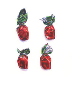
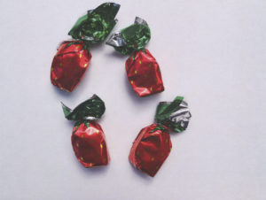
Each one of my drawings is an opportunity to enhance the subject matter I photograph. Strawberry Candy is a great example of this. The color in my final drawing is much more vibrant and bright, allowing the crinkles and folds of the wrapper to pop adding a 3D quality. Also, I removed some shadows to emphasize the form of the wrapper, and decided to straighten and align the final composition. I love this investigative look at each of the four candies. They almost remind me of carefully arranged flowers or butterflies in an old Victorian illustrative drawing.
Enjoy!
33/60 for my CSArt candy project.


